





IELTS bar charts are among the most common visual tasks in IELTS Academic Writing Task 1. They test your ability to read data accurately, identify the most important information, and present it in clear, well-organized English. Many candidates lose marks here not because their English is weak, but because they describe every bar one by one without showing the examiner what the data means.
A bar graph displays values for different categories, often across several groups or time periods. The bars make it easy to compare quantities at a glance, so your task is to guide the reader through that comparison. The examiner wants to see that you can identify the overall picture, highlight the key contrasts, and support your points with accurate figures.
This guide covers a clear template for organizing your answer and practical tips to reach Band 7.
Template For Bar Graph IELTS
A strong bar graph answer usually has four parts. Keep this structure in mind and you will always know what to write next.
- Introduction (1–2 sentences)
- Paraphrase the title of the graph, changing the wording but keeping the meaning. Mention what is being measured, the time period, and any groups or categories shown. Avoid copying the title word for word, as examiners notice this and it does little to show your range.
- Overview (2–3 sentences)
- State the most important trends or the main differences. Do not include exact figures here. Identify the highest and lowest values, or the biggest change, in general terms such as “the most popular option” or “a steady decline.” This paragraph has a major effect on your Task Achievement score, so give it real thought. A clear overview is often what separates a Band 6 answer from a Band 7 answer.
- Body Paragraph 1
- Describe the first group of data, or the first part of the time period. Include the highest value, the lowest value, and two or three other key figures. Use comparison language to link the figures together, so the paragraph reads as an analysis rather than a list of numbers.
- Body Paragraph 2
- Describe the remaining data, or the later part of the time period. Focus on contrasts, changes, and notable exceptions. Avoid repeating the same figures you used in the first body paragraph.

Quick reminders for structure:
- Never write a conclusion. In Task 1, the overview replaces it.
- Aim for around 150 to 180 words in total.
- Do not offer personal opinions or speculate about the causes of the data. Task 1 asks you to report, not to explain.
Tips to Score 7+ Bands in IELTS BAR Graph
Study the graph before you write
- Spend the first two or three minutes looking at the graph carefully. Identify the highest and lowest values, the overall trend, and any surprising results. Good planning prevents the most common problem in this task, which is writing without a clear sense of what matters most.
Write the overview first
- Once you know the big picture, the body paragraphs become much easier to organise. Writing the overview early also ensures that your answer has a clear central message from the start, rather than one that appears only at the end of your writing.
Group related data together
- Do not describe each bar in the order it appears on the axis. Group related categories, such as those that rise together or those that sit at similar levels. Examiners reward logical grouping because it shows analytical thinking and makes your answer easier to follow.
Vary your comparison structures
- Use a range of expressions such as “is twice as high as,” “accounts for nearly a third of,” and “outnumbers,” so you do not rely on “is higher than” in every sentence. Variety in vocabulary and grammar is central to the Lexical Resource and Grammatical Range criteria.
Use approximate language when precision is not needed
- Phrases such as “just under,” “roughly,” and “in the region of” show control of the language. They also allow you to avoid overloading your answer with exact figures when a rounded number communicates the point clearly.
Check units, labels, and time periods
- Read the title, axis labels, and legend carefully. Confirm whether the figures are in thousands, millions, percentages, or another unit. Confirm the years or months covered. Mistakes here are common, easy to avoid, and costly.
Double-check every figure
- A single incorrect number can affect your Task Achievement score, and examiners do check. Before you finish, compare each number you have written with the graph.
Mix sentence types
- Combine simple and complex sentences, and use the passive voice where it fits naturally, such as “was recorded at” or “was surpassed by.” A mix of structures shows grammatical control without making the writing feel forced.
Practice under timed conditions
- Work in 20-minute sessions, the time you should spend writing Task 1. Finishing with a few minutes left to check your work is a sign of good time management, and it gives you a chance to catch errors before the examiner does.
Mistakes to Avoid
Describing every single bar
- Listing all the data without selecting the key points is the most frequent error. It makes your answer long, repetitive, and hard to follow, and it usually leads to a lower Task Achievement score.
Missing or weak overview
- If you do not identify the main trends in general terms, the examiner may conclude that you have not understood the graph. Always include a clear overview.
Writing a conclusion
- Ending with a summary paragraph that repeats the data is unnecessary and can distract from your overview. Use the overview to deliver your main points instead.
Giving opinions or explanations
- Phrases such as “I think this is because” or “the reason for this is” are not required in Task 1. Stay with what the graph shows.
Copying the question wording
- Using the exact title word for word limits your Lexical Resource score. Paraphrase the introduction and use synonyms for key terms such as “increase” and “decrease.”
Incorrect data reporting
- Misreading values, mixing up years, or confusing units damages your accuracy. Recheck every number before moving on.
Ignoring the word count
- Writing fewer than 150 words can cost marks for development, while writing much more wastes time. Aim for about 150 to 180 words.
Vocabulary For IELTS Writing Task 1 Bar Graph
| Category | Vocabulary and Phrases |
| Introduction | Illustrates, depicts, presents, compares, shows, provides information about |
| Overview | Overall, generally, on the whole, it is evident that, the most noticeable feature, it is clear that |
| Increase | Rise, increase, grow, climb, surge, soar, jump, edge up, rise considerably, increase marginally |
| Decrease | Fall, decline, drop, dip, plunge, plummet, slide, edge down, decrease significantly, fall slightly |
| Highest and Lowest | The highest, the lowest, the largest, the smallest, the greatest, the least, peak, rank first, rank last |
| Comparison | Higher than, lower than, greater than, less than, exceed, surpass, outnumber, twice as high as, half as much as |
| Similarity and Difference | Similar to, comparable to, nearly identical, almost equal to, differ from, contrast with, a noticeable gap, a significant difference |
| Stability and Fluctuation | Remain stable, stay constant, remain unchanged, level off, fluctuate, vary, rise and fall, show little change |
| Approximation | Approximately, roughly, around, about, nearly, almost, just over, just under, slightly above, slightly below |
| Numbers and Proportions | Figure, number, total, percentage, proportion, share, fraction, distribution, account for, represent, constitute |
| Linking Words | However, whereas, while, by contrast, in comparison, similarly, likewise, furthermore, moreover, meanwhile |
| Data and Time Expressions | Stand at, reach, record, amount to, make up, initially, subsequently, thereafter, over the period, by the end of the period, respectively |
IELTS Bar Chart Sample Questions With Answers
Bar Chart 1:
 Description:
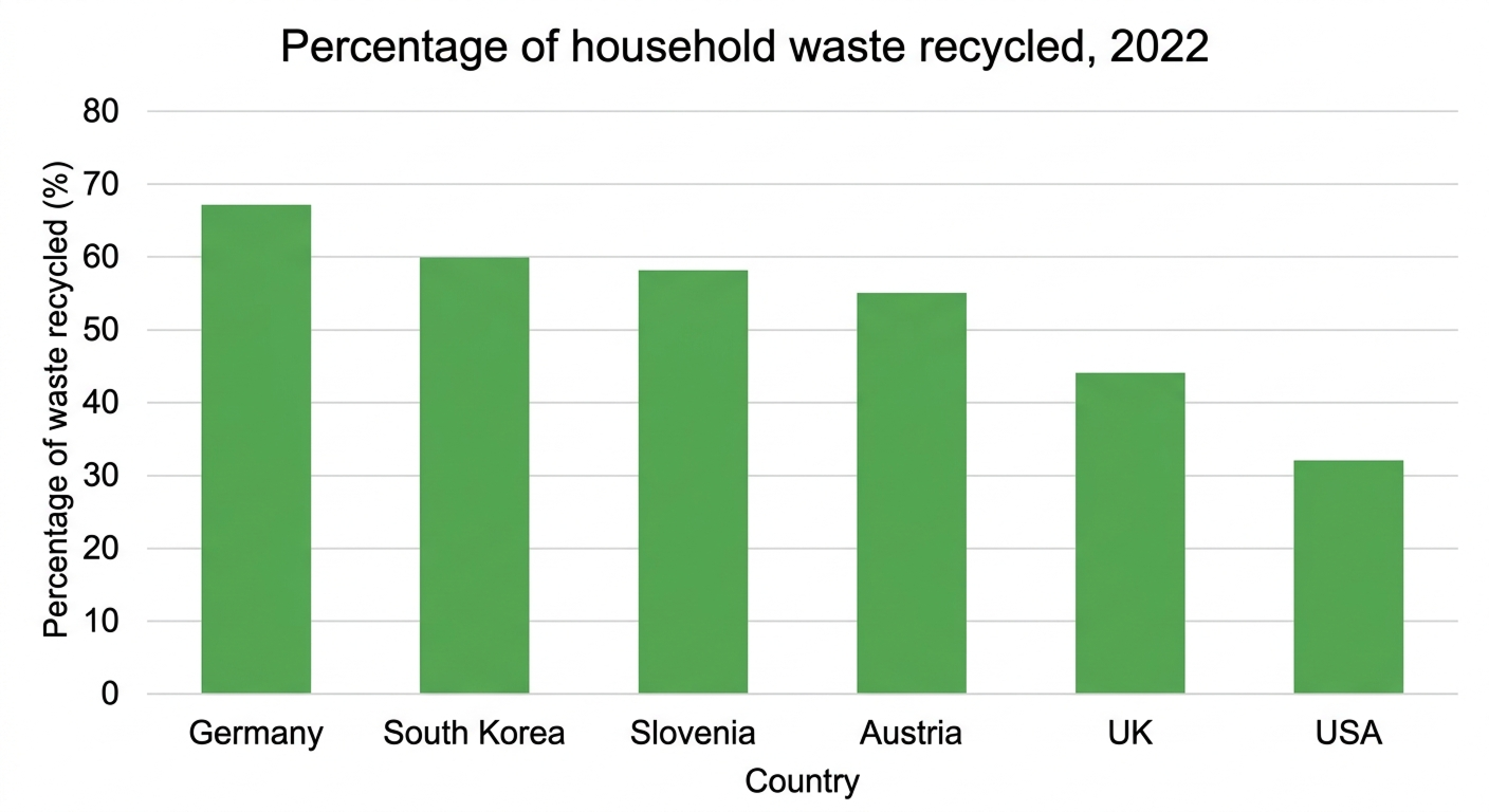
The bar chart compares the percentages of household waste recycled in six countries, namely Germany, South Korea, Slovenia, Austria, the UK and the USA, in 2022.
Overall, Germany recorded the highest recycling rate, while the USA had the lowest. Four countries recycled more than half of their household waste, whereas the UK and the USA reported comparatively lower figures.
Germany ranked first, recycling approximately 67% of household waste. South Korea followed at 60%, while Slovenia stood slightly lower at 58%. The difference among these three countries was relatively small, with Germany maintaining a clear lead over the others.
Austria also performed well, with around 55% of household waste being recycled, placing it fourth among the six countries. In comparison, the UK recorded a lower rate of 44%, which was 11 percentage points below Austria’s figure. The USA ranked last, with only 32% of household waste recycled, 12 percentage points lower than the UK. Notably, Germany’s recycling rate was more than twice that of the USA, demonstrating a significant gap between the highest and lowest figures.
Bar Chart 2:
Description:
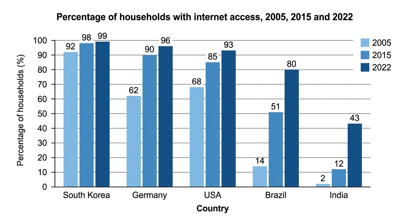
The bar chart compares household internet access in South Korea, Germany, the USA, Brazil and India in 2005, 2015 and 2022.
Overall, internet access increased in all five countries. South Korea consistently recorded the highest figures, while India had the lowest. Brazil and India experienced the most substantial growth.
In South Korea, access rose from 92% in 2005 to 98% in 2015, reaching 99% in 2022. Germany’s figure increased from 62% to 90% before climbing to 96%. Similarly, the USA experienced growth from 68% in 2005 to 85% in 2015, eventually reaching 93% in 2022.
Brazil and India started with considerably lower access rates but recorded dramatic increases. Brazil’s proportion climbed from 14% in 2005 to 51% in 2015 and 80% in 2022. India followed a similar trend, rising from just 2% to 12% and then 43%. Despite this progress, India remained the lowest, with internet access 56 percentage points below South Korea in 2022.
Bar Chart 3:
Description:
The bar chart compares the percentages of households with internet access in South Korea, Germany, the USA, Brazil and India in 2005, 2015 and 2022.
Overall, internet access increased in all five countries. South Korea consistently recorded the highest figures, whereas India had the lowest. Brazil and India experienced the most significant growth over the period.
In South Korea, household internet access rose from 92% in 2005 to 98% in 2015, reaching 99% in 2022. Germany also saw substantial growth, with its figure increasing from 62% to 90% before reaching 96% in the final year. Similarly, the proportion in the USA climbed from 68% in 2005 to 85% in 2015 and 93% in 2022.
Brazil experienced a remarkable increase, rising from 14% in 2005 to 51% in 2015 and 80% in 2022. India followed a similar pattern, with access growing from just 2% to 12% and then 43%. Despite this progress, India remained behind the other countries in 2022.
Bar Chart 4:

Description:
The bar chart compares the percentages of commuters using public transport in five European cities, namely London, Paris, Berlin, Madrid and Rome, in 2010 and 2020.
Overall, public transport usage increased in all five cities over the decade. Paris recorded the highest proportions in both years, whereas Rome had the lowest figures. London experienced the largest increase during this period.
In 2010, Paris had the highest share of public transport users, at approximately 55%, followed by Berlin at 48%. London ranked third, with 42% of commuters using public transport. Meanwhile, the figures for Madrid and Rome were comparatively lower, at 38% and 32%, respectively.
By 2020, usage had risen considerably across all five cities. Paris remained in the lead at 68%, while Berlin reached 62%. London also experienced significant growth, climbing from 42% to 58%, an increase of 16 percentage points. Similarly, Madrid’s figure rose from 38% to 51%, while Rome recorded an increase from 32% to 44%. These changes indicate a growing preference for public transport across all five European cities.
Bar Chart 5:
Description:
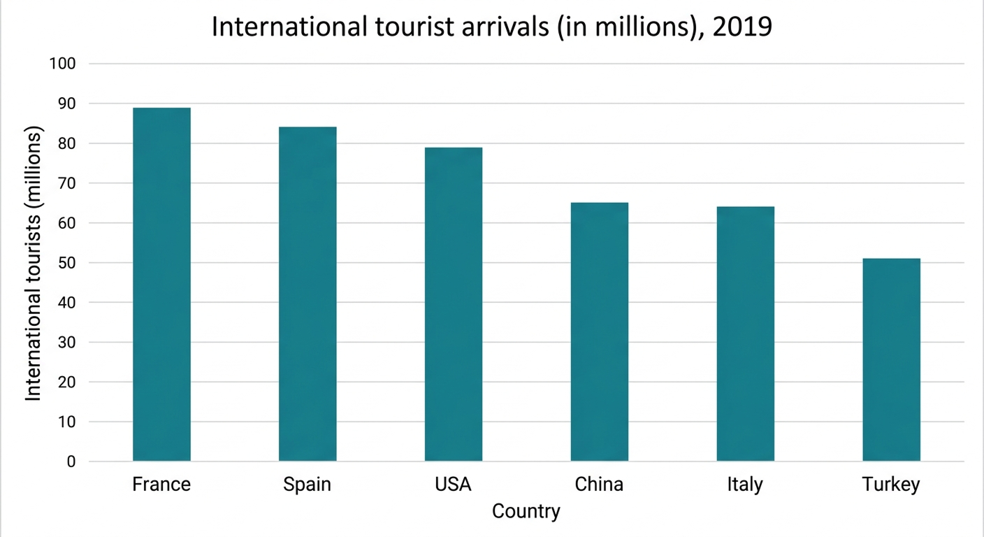
The bar chart illustrates the number of international tourist arrivals in six countries, namely France, Spain, the USA, China, Italy and Turkey, in 2019, measured in millions.
Overall, France was the most popular destination, followed by Spain and the USA, whereas Turkey received the fewest international visitors. The figures generally declined across the six countries.
France welcomed approximately 89 million international tourists, ranking first among the destinations shown. Spain followed closely, attracting around 84 million visitors, while the USA recorded approximately 79 million arrivals. The difference between France and Spain was relatively small, at just five million tourists.
China and Italy received comparable numbers of international visitors. China attracted approximately 65 million tourists, slightly more than Italy, which recorded around 64 million arrivals. Both countries welcomed considerably fewer visitors than the USA, with a gap of roughly 14 to 15 million. Turkey ranked last, receiving approximately 51 million international tourists. This was around 38 million fewer than France, highlighting the substantial difference between the most and least popular destinations in 2019.
Bar Chart 6:
Description:
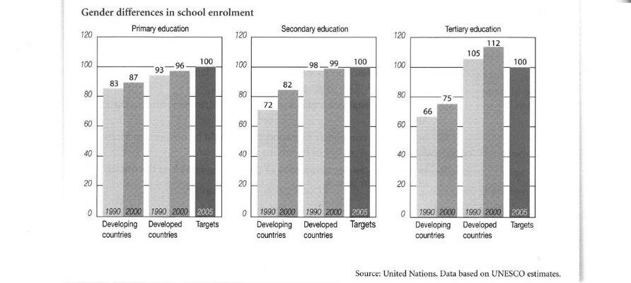
The bar charts compare gender differences in school enrolment in developing and developed countries at the primary, secondary and tertiary levels in 1990 and 2000, alongside the targets for 2005.
Overall, enrolment increased in both groups at all three levels. However, developed countries consistently recorded higher figures than developing nations. While developed countries exceeded the tertiary education target, developing countries remained below it.
In primary education, enrolment in developing countries rose from 83 in 1990 to 87 in 2000, whereas developed countries increased from 93 to 96. The target was 100. Similarly, secondary enrolment in developing countries climbed from 72 to 82, while the figure for developed countries grew slightly from 98 to 99, approaching the same target.
The greatest differences appeared at the tertiary level. Developing countries experienced an increase from 66 in 1990 to 75 in 2000. In contrast, developed countries recorded significantly higher figures, rising from 105 to 112. Thus, developed countries had already surpassed the target of 100, whereas developing countries continued to lag considerably behind.
Bar Chart 7:
Description:
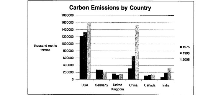
The bar chart compares carbon emissions in six countries, namely the USA, Germany, the United Kingdom, China, Canada and India, in 1975, 1990 and 2005, measured in thousand metric tonnes.
Overall, the USA was the largest emitter in 1975 and 1990, while China experienced a dramatic rise and became a major contributor by 2005. In contrast, emissions in Germany and the UK generally declined, whereas India recorded steady growth.
In the USA, carbon emissions increased from approximately 1.2 million in 1975 to 1.3 million in 1990, before reaching 1.6 million in 2005. China showed a sharper upward trend, rising from around 300,000 to 650,000, then surging to approximately 1.5 million.
Germany’s emissions declined from about 280,000 in 1975 to 200,000 in 2005, despite a slight rise in 1990. Similarly, the UK’s figure fell from roughly 150,000 to 100,000. Meanwhile, Canada’s emissions remained relatively stable, fluctuating between 100,000 and 150,000. India’s emissions also increased, reaching approximately 300,000 by 2005.
Bar Chart 8:
Description:
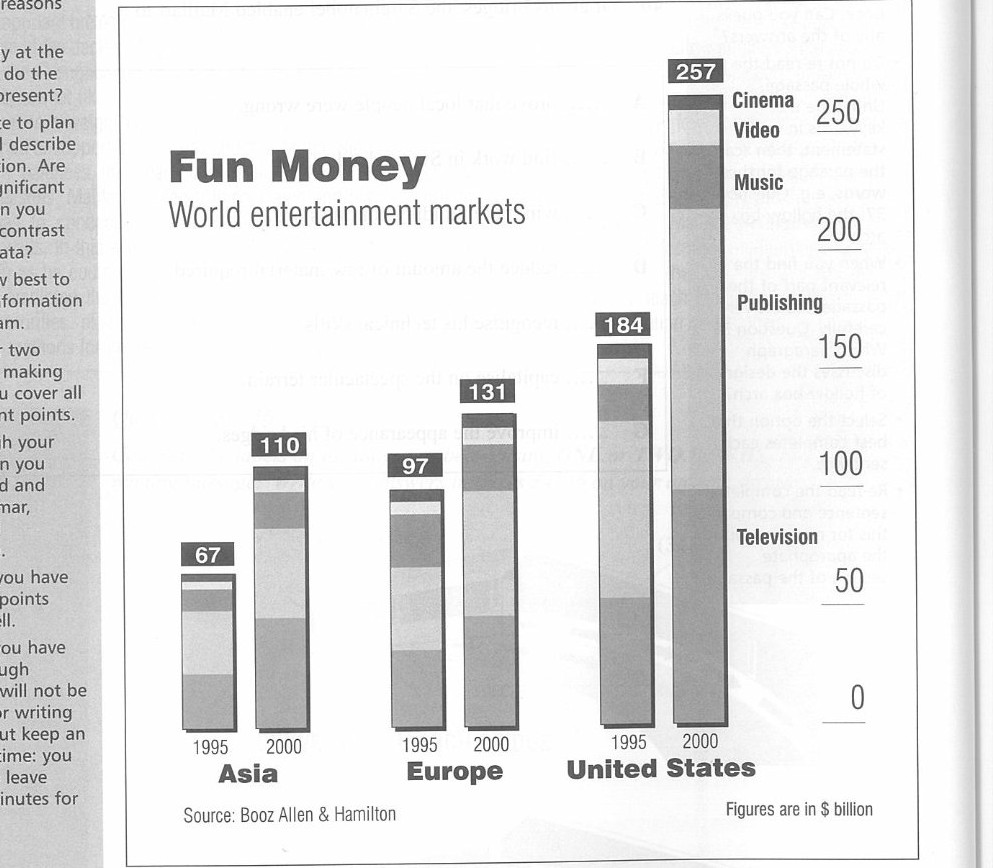
The bar chart compares the entertainment market sizes in Asia, Europe and the United States in 1995 and 2000, measured in billions of dollars. It also illustrates five sectors: television, publishing, music, video and cinema.
Overall, the United States had the largest entertainment market in both years, while Asia experienced the strongest relative growth. All three regions recorded increases, with the USA showing the greatest rise in absolute terms.
In Asia, the market value increased from $67 billion in 1995 to $110 billion in 2000, a rise of $43 billion. Similarly, Europe’s entertainment industry grew from $97 billion to $131 billion, representing an increase of $34 billion.
The United States maintained its leading position, with its market expanding from $184 billion in 1995 to $257 billion in 2000. This growth of $73 billion was considerably greater than that of the other regions. By 2000, the American market was more than twice the size of Asia’s and nearly twice that of Europe’s. Television, publishing, music, video and cinema contributed to the overall market across these regions.
Bar Chart 9:
Description:
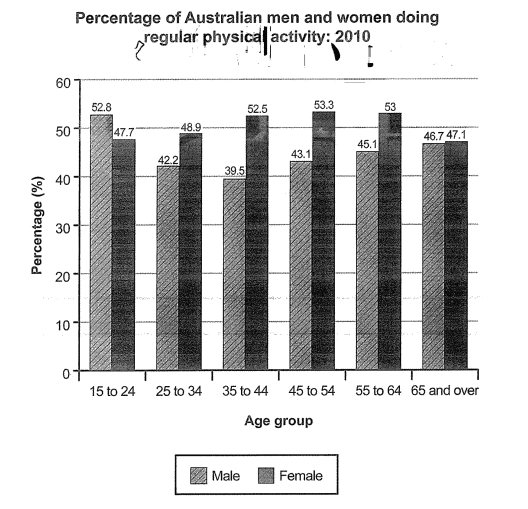
The bar chart compares the percentages of Australian men and women in six age groups who participated in regular physical activity in 2010.
Overall, women were more active than men in all age groups except those aged 15 to 24. Men recorded their highest participation rate among the youngest group, while women peaked in the 45–54 age category.
Among men, 52.8% of those aged 15 to 24 exercised regularly, compared with 47.7% of women. However, the male figure fell to 42.2% among 25–34-year-olds and reached a low of 39.5% in the 35–44 group. It then increased gradually to 43.1% for those aged 45–54, 45.1% among 55–64-year-olds and 46.7% in the oldest group.
In contrast, female participation rose from 47.7% in the youngest group to 48.9% among 25–34-year-olds. It increased further to 52.5%, peaking at 53.3% among women aged 45–54. The rate then dipped slightly to 53% before falling to 47.1% among those aged 65 and over.
Bar Chart 10:
Description:
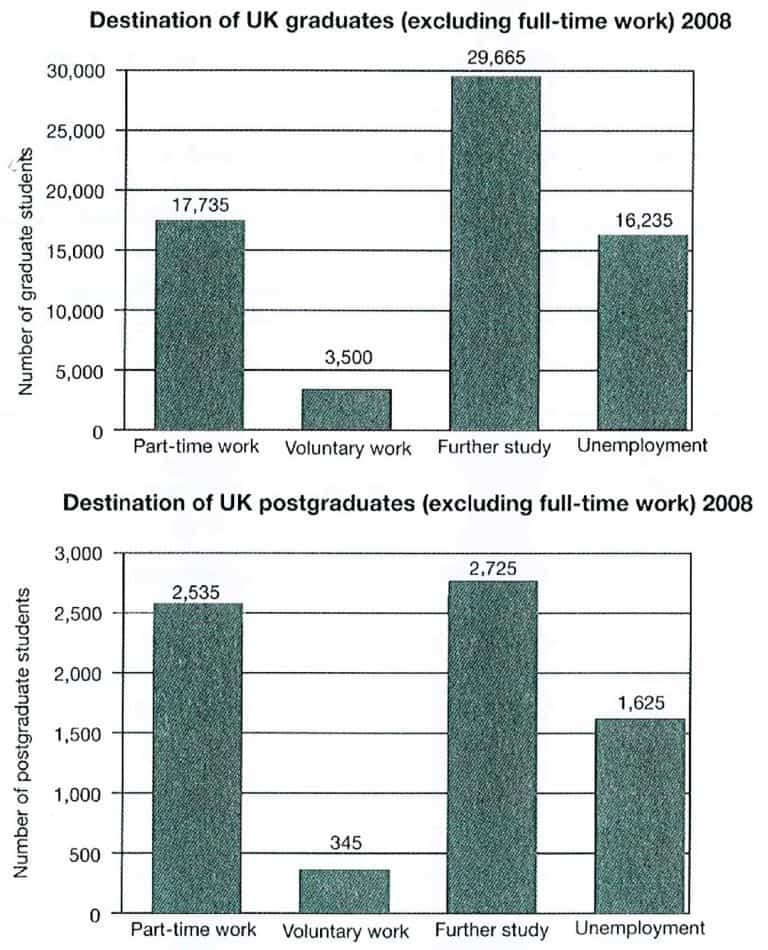
The bar charts compare the destinations of UK graduates and postgraduates who did not enter full-time employment in 2008, including part-time work, voluntary work, further study and unemployment.
Overall, further study was the most popular choice for both groups, whereas voluntary work was the least common. Graduates outnumbered postgraduates in every category.
Among graduates, 29,665 pursued further study, making it the largest category. Part-time employment ranked second, with 17,735 individuals, followed by 16,235 unemployed graduates. Voluntary work attracted the fewest participants, totalling just 3,500.
A similar pattern emerged among postgraduates. Further study remained the leading option, chosen by 2,725 individuals, while 2,535 entered part-time employment. Meanwhile, 1,625 postgraduates were unemployed. Voluntary work was again the least popular destination, involving only 345 people.
Further education and part-time employment were the main destinations for both groups in 2008, while voluntary work consistently recorded the lowest figures. The number of graduates was considerably higher than that of postgraduates across all four categories.
Scoring a higher band in IELTS requires consistent practice across all four sections, both individually and together. With Gurully, you can take full-length mock tests with instant AI scoring to evaluate your performance, identify areas for improvement, and experience a real-time exam simulation. Practice smarter, track your progress, and work towards your target band with confidence.
FAQ:
How do I write an IELTS bar chart answer?
How many words should I write for an IELTS bar chart?
How do I describe a bar chart with many bars?
How is an IELTS bar chart answer scored?
What is the difference between an IELTS bar chart and a line graph?
Also Read
IELTS Writing Task 1 Sample Answers