
For those who are preparing for the PTE exam, acing speaking section is essential as it evaluates your overall English communication skills through a range of tasks. While most of the tasks are easy to score, describe image seems challenging. In the task, you need to describe various image types, such as bar graphs, pie charts, Venn diagrams, line graphs, donut charts, and real-life scenarios. Among these, the PTE line graph can be tricky to explain.
However, with the correct template and tricks, you can excel in this task easily. In this blog, you will find tips, templates, and frequently asked PTE describe image line graph questions with answers. Read them carefully and bookmark them for the future.
Practice with Predictive PTE Line Graph Questions
PTE Describe Image Line Graph Template
- Introduction (1 sentence):
- “The line graph describes [about what the graph is] over the period of [time frame].”
- Overview (1 sentence):
- “Overall, it can be noticed that [general trend: an increase, decrease, fluctuation, stability, etc.], with [highlight any significant feature or comparison].”
- Key Details (2–3 sentences):
- “At the beginning of the period, [mention the starting figure for one or more elements].”
- “Then, it [rose/fell/remained stable], reaching [value] in [year].”
- “In comparison/Meanwhile, [another element] showed a [different or similar] trend.”
- Conclusion (optional):
- “In summary, the graph highlights [main insight or final trend].”

Most Repeated PTE Line Graph Sample Questions with Answer
Sample Question 1:
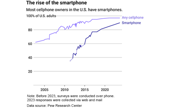
Description:
The line graph shows the increase in cell phone and smartphone ownership in the United States over time. The percentage of U.S. adults owning a cell phone has been consistently high, exceeding 80% since around 2010. Meanwhile, smartphone ownership has seen a rapid rise, especially after 2010, reaching over 60% by 2015 and continuing to grow steadily. The data collection method changed in 2023, shifting from phone surveys to web and mail responses. Overall, the trend highlights the increasing reliance on smartphones among U.S. adults.
Sample Question 2:
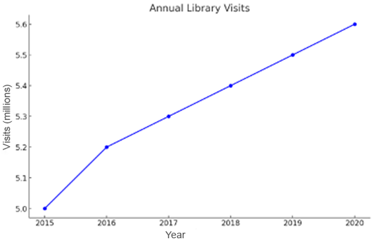
Description:
The line graph depicts the trend in annual library visits from 2015 to 2020. The number of visits starts at 5 million in 2015 and shows a consistent upward trend, reaching approximately 5.6 million by 2020. The data suggests a steady increase in library usage over the years, indicating a growing interest in library resources. Overall, the trend highlights the sustained relevance of libraries despite technological advancements.
Sample Question 3:
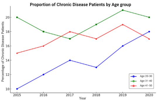
Description:
The line graph illustrates the percentage of chronic disease patients in three age groups from 2015 to 2020. The 31-40 age group consistently has the highest proportion, peaking in 2019. The 41-50 group follows a fluctuating trend, while the 20-30 group shows a steady rise. The chart indicates an increasing prevalence of chronic diseases, particularly among younger populations over time.
Sample Question 4:
Description:
The line graph illustrates the annual incidence rates of heart disease and diabetes from 2008 to 2016. The incidence rate of diabetes, shown in blue, is consistently higher than that of heart disease and follows an upward trend, increasing from around 0.40% to 0.44%. Heart disease, represented in red, also shows a gradual increase from approximately 0.30% to 0.33%. Overall, both conditions have shown a rising trend over time, indicating growing health concerns.
![]() Mistakes to Avoid
Mistakes to Avoid
- Reading the graph like a story instead of giving a structured description.
- Mentioning every single number (time-consuming and unnecessary).
- Forgetting to state the overall trend before details.
- Using casual words like goes up or goes down instead of academic terms (increases, declines).
- Ignoring the time frame or units shown on the graph.
Sample Question 5:
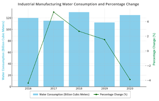
Description:
The combination chart depicts industrial manufacturing water consumption and its percentage change from 2016 to 2020. Water consumption, shown in blue bars, remains relatively stable, with a peak in 2018. The green line represents percentage change, showing a sharp increase in 2017 followed by a steady decline. The data suggests that while total water consumption remains high, its rate of change has decreased significantly in recent years.
Sample Question 6:
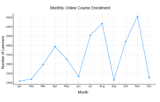
Description:
The line graph represents the number of learners enrolling in online courses each month. Enrolment starts low in January and rises sharply, peaking in April. It then declines in May and June before experiencing another increase in July and August. September sees a sharp drop, followed by another peak in November, reaching its highest point. The trend indicates fluctuating enrolment, possibly influenced by academic schedules and seasonal demand.
Sample Question 7:
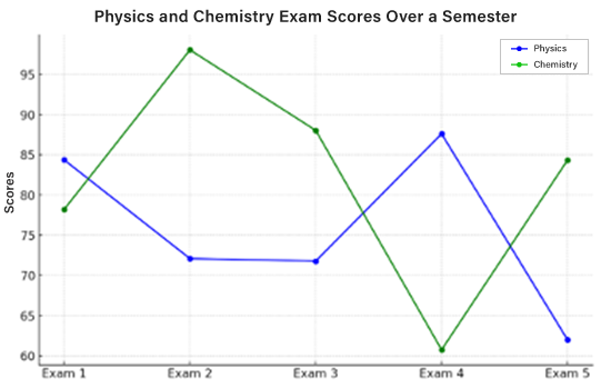
Description:
The line graph compares students’ exam scores in physics and chemistry over five exams. Chemistry scores fluctuate significantly, peaking in Exam 2 and dropping in Exam 4. Physics scores show moderate variation, with the highest score in Exam 4. The graph highlights that chemistry scores have higher volatility than physics scores.
Sample Question 8:
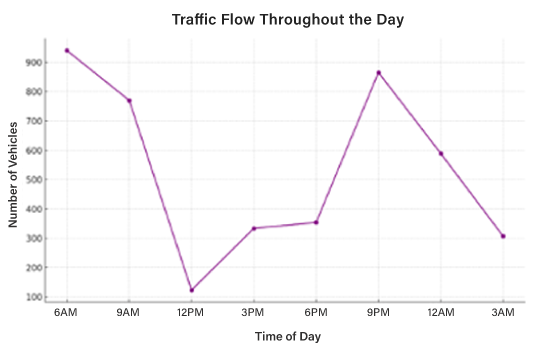
Description:
The line graph depicts vehicle traffic at different times of the day. Traffic is highest at 6 AM, declines sharply by noon, and gradually rises in the afternoon. Another peak occurs at 9 PM before decreasing again. The chart suggests that traffic congestion is heaviest during morning and evening rush hours.
Sample Question 9:
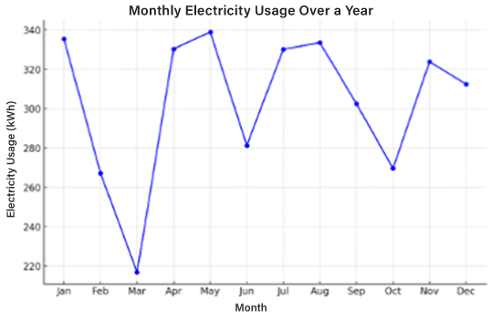
Description:
The line graph shows electricity consumption trends throughout the year. Usage starts high in January at around 340 kWh, drops sharply in February, reaching its lowest in March, and then surges in April. The highest consumption occurs in May, followed by a slight dip in June and fluctuations until October. A significant increase is observed in November before slightly decreasing in December. The trend suggests seasonal variations in electricity demand, possibly influenced by weather and heating/cooling needs.
Sample Question 10:
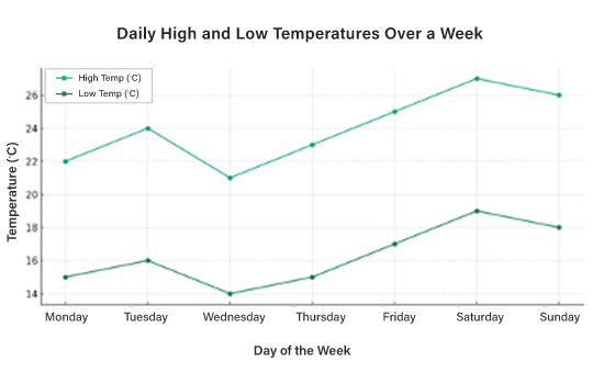
Description:
The line graph depicts temperature variations throughout a week, showing both daily high and low temperatures. High temperatures peak on Saturday at 27°C, while lows are consistently around 14-18°C. Tuesday and Thursday experience minor dips, while a steady increase is observed towards the weekend. The graph suggests that the temperature follows a general warming trend as the week progresses, possibly due to seasonal changes or climatic patterns.
Sample Question 11:
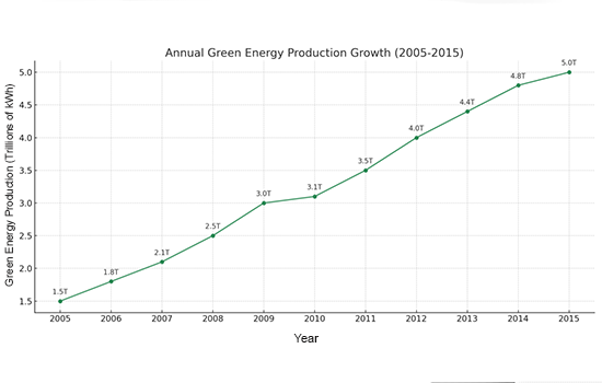
Description:
The line graph illustrates the increase in green energy production over a decade. Starting at 1.5 trillion kWh in 2005, production grew steadily, reaching 2.5 trillion kWh by 2008. It surpassed 3.5 trillion kWh in 2011 and continued rising, peaking at 5.0 trillion kWh in 2015. The chart highlights consistent growth in renewable energy production, emphasizing the global shift towards sustainable energy sources.
You can practice more of these Describe image questions for free on Gurully. Our platform provides full-length mock tests with real-time exam simulation. These mock tests are curated by exam experts, which give instant AI scoring just like the real exam. To strengthen individual sections, you can practice on section-wise tests. Achieve your target score in the PTE exam smoothly by practicing online on Gurully.
Tips for Scoring High in PTE Line Graph
1. Identify Key Points
- Pay attention to trends: Check increase, decrease, or any changes which are leading to fluctuations in the line.
- Look for the highest and lowest points: The highest and lowest data points describe the key features of the graph.
2. Avoid Overloading with Data
Sum up details in short. Avoid describing every single detail; instead, highlight the trends and changes. For example, instead of listing all data points, explain the changes:
- In the graph, there is a sharp decline from 2003 to 2005, followed by a steady increase.
- There was a sharp increase from 2000 to 2005, followed by a gradual increase until 2010.
3. Explain the line graph by using time frames:
When describing the image, be specific about the time period and avoid using uncertain terms like “later” or “after a while.” For example:
- Wrong: “The number of tourists increased after a while.”
- Correct: “The number of tourists increased significantly between 2010 and 2015 December.”
4. Use Varied Vocabulary
Use various vocabulary while explaining about the PTE line graph
| Verbs for Change | increase, decrease, rise, fall, fluctuate, peak, dip, stabilize, etc. |
| Adjectives for Intensity | gradual, rapid, sharp, slight, dramatic, steady, significant, etc. |
| Adverbs for Change | steadily, dramatically, slightly, moderately, sharply, quickly, etc. |
5. Describe Trends Rather Than Exact Numbers
When explaining the PTE line graph, focus on overall trends rather than specific figures. For example:
- “From 2010 to 2015, the line gradually fell, dipping at around 2015 before rising sharply.”
- “The line remained moderately stable for the first half, then saw a significant rise towards the end.”
Explain the group data trends if the graph has multiple lines. For example:
- “The first line shows a steady increase, while the second fluctuates between a rise and fall.”
Start your free PTE mock test with Gurully and get AI-powered analysis for a personalized journey.

- Kickstart your PTE prep with a free AI-scored mock test
- Boost your score with in-depth analysis & smart recommendations
Conclusion:
The PTE Describe Image task, particularly line graphs, can be challenging but manageable with the right approach. By using a proven template, focusing on key trends rather than exact data, and using varied vocabulary, candidates can present their responses clearly and confidently. Practice for PTE exam with realistic exam experience on Gurully. Practice question-wise and section-wise tests designed to simulate the actual exam environment. Consistent practice will lead you toward your desired PTE score.
FAQ:
How to get a good score in Describe Image PTE?
How to get 79+ in PTE Writing?
How to get 70 in PTE Speaking?
What is the 3-second rule in PTE?
What is 4.5 in PTE score?
Also Read:
- PTE Describe Image Template 2025 – Practice with 50 Examples
- Bar Graph PTE Describe Image – Tips, Templates & Examples to Score High
- PTE Map Chart – Tips, Template, & Sample Questions With Answers
- Score High in PTE Pie Chart – Template, Tips and Sample Questions with Answers
Free PTE Practice Test